OVERVIEW

Ally Bank native onboarding

Ally’s web-based account opening flow created friction in an increasingly mobile-first world. To remain competitive, the company needed a fully native onboarding experience. I led the UX design of Ally’s first native mobile account opening flow.

This experience increased application starts to 18% and completion rates to 55%, outperforming all other digital channels.

CONTEXT

Lead the design for Ally Bank’s first native account opening onboarding flow.

ROLES

UI/UX Design, Information Architecture, User Flows, wireframes, Prototypes, Motion Direction.

TIMELINE

Nov. 2023 – Present

Discovery

BUSINESS PROBLEM

A web-wrapped account opening flow was causing high abandonment and missed funding

We needed a native experience that could compete with modern mobile apps.

USER PROBLEM

Users dropped off before submitting applications and rarely completed funding

This is due to unclear expectations, confusing verification, and hesitation to fund before card receipt.

Current web-wrapped experience

Competitive & Current State Analysis

A web based flow created friction while competitors delivered seamless native onboarding

Our audit revealed unclear UI patterns, fragmented steps, and long perceived completion times that contributed to hesitation and drop off. In contrast, competitors like TD, Capital One, Fifth Third, and Wealthfront offered streamlined native onboarding with clearer guidance and faster paths to completion.

User JOURNEY MAPPING

Mapping Logan’s emotional highs and friction points across the onboarding experience

Using Logan as a guiding persona, I mapped key actions, decision moments, and emotional shifts throughout the account opening flow. The journey map surfaced points of confusion and anxiety, helping prioritize clarity and reassurance at critical steps like verification and funding.

Process

USER flow

I mapped current vs. ideal journeys, reducing unnecessary steps and clarifying decision points

Key moments like verification and funding were redesigned to be informative and supportive.

Yellow stickies highlight flow improvements

Prototyping 

Translating wireframe to designs and prototypes

I started with wireframes to organize the experience and clarify information architecture. From there, I designed high-fidelity mockups using scalable UI components. Interactive prototypes allowed us to test and refine solutions tied directly to user friction points before moving into build.

usability testing

Improving funding clarity

I tested interactive Figma prototypes with 11 Ally prospects to evaluate the funding experience. Several participants misunderstood the conditions tied to instant funding, particularly the messaging above the payment option. Some were unclear about deposit limits, while others assumed “available when you add money now” meant funds would arrive within minutes.

System Usability Scale (SUS)

The redesigned flow achieved a System Usability Scale (SUS) score of 95.0, placing it well above industry benchmarks and validating the clarity of the experience.

Reflection

takeaways and learnings

When timelines shrink, leadership grows

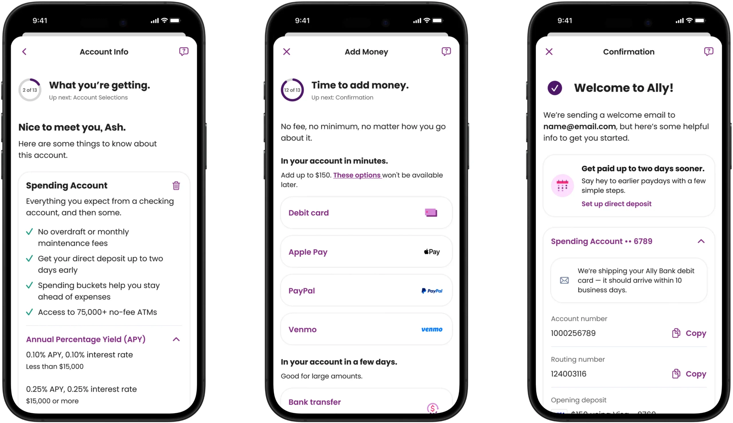
This project reinforced the importance of proactive alignment and clear documentation on complex, cross-functional work. Midway through the initiative, business priorities shifted and we were asked to complete all MCP tickets by the end of 2024, compressing work originally planned through February 2025 into a six-week sprint. The sudden acceleration created uncertainty, but it demanded sharper prioritization and tighter collaboration.

During that sprint, I generated solutions quickly, tested ideas in rapid cycles, and gathered feedback in real time. Working under pressure strengthened my ability to lead through ambiguity without compromising quality. Seeing the experience live in customers’ hands and knowing it helps them take financial steps with greater clarity and confidence made the challenge worth it.